
Card - Flowbite Vue
Get started with a large variety of Tailwind CSS card examples for your web project
Card - Flowbite
Original reference: https://flowbite.com/docs/components/card/
Use these responsive card components to show data entries and information to your users in multiple forms and contexts such as for your blog, application, user profiles, and more. The card supports three layout variants: default, image, and horizontal.
Default Card
Use the FwbCard component to wrap any content in a rounded, shadowed card. Set href to make the entire card a clickable link rendered as an <a> element.
<template>
  <fwb-card href="#" class="min-w-sm">
    <div class="p-5">
      <h5 class="mb-2 text-2xl font-bold tracking-tight text-gray-900 dark:text-white">
        Noteworthy technology acquisitions 2021
      </h5>
      <p class="font-normal text-gray-700 dark:text-gray-400">
        Here are the biggest enterprise technology acquisitions of 2021 so far, in reverse chronological order.
      </p>
    </div>
  </fwb-card>
</template>

<script setup>
import { FwbCard } from 'flowbite-vue'
</script>
Card with Image
Set variant="image" and provide img-src to display a top image above the card content. Use img-alt to describe the image for accessibility.

Noteworthy technology acquisitions 2021
Here are the biggest enterprise technology acquisitions of 2021 so far, in reverse chronological order.
<template>
  <fwb-card
    img-alt="Desk"
    img-src="https://flowbite.com/docs/images/blog/image-1.jpg"
    variant="image"
    class="min-w-md"
  >
    <div class="p-5">
      <h5 class="mb-2 text-2xl font-bold tracking-tight text-gray-900 dark:text-white">
        Noteworthy technology acquisitions 2021
      </h5>
      <p class="font-normal text-gray-700 dark:text-gray-400">
        Here are the biggest enterprise technology acquisitions of 2021 so far, in reverse chronological order.
      </p>
    </div>
  </fwb-card>
</template>

<script setup>
import { FwbCard } from 'flowbite-vue'
</script>
Horizontal Card
Set variant="horizontal" to place the image on the left side and the content on the right, suitable for blog previews and media cards.
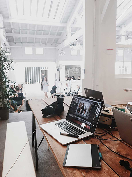
Noteworthy technology acquisitions 2021
Here are the biggest enterprise technology acquisitions of 2021 so far, in reverse chronological order.
<template>
  <fwb-card
    img-alt="Desk"
    img-src="https://flowbite.com/docs/images/blog/image-4.jpg"
    variant="horizontal"
    class="min-w-lg"
  >
    <div class="p-5">
      <h5 class="mb-2 text-2xl font-bold tracking-tight text-gray-900 dark:text-white">
        Noteworthy technology acquisitions 2021
      </h5>
      <p class="font-normal text-gray-700 dark:text-gray-400">
        Here are the biggest enterprise technology acquisitions of 2021 so far, in reverse chronological order.
      </p>
    </div>
  </fwb-card>
</template>

<script setup>
import { FwbCard } from 'flowbite-vue'
</script>
Card component API
FwbCard Props
| Name | Type | Default | Description |
|---|---|---|---|
| href | String | '' | When set, renders the card as an <a> element linking to this URL. |
| imgAlt | String | '' | Alt text for the card image. Used with variant="image" or "horizontal". |
| imgSrc | String | '' | URL of the image displayed on the card. |
| variant | 'default' | 'image' | 'horizontal' | 'default' | Controls card layout. image adds a top image; horizontal places the image on the left. |
| class | String | '' | Additional Tailwind classes applied to the card wrapper. |
FwbCard Slots
| Name | Description |
|---|---|
| default | The card body content. |